Aksinya Health
Aksinya | Health from Within
Creative Direction • Identity Design • Logo Design
Audience:
Women seeking to restore their health and nutrition
Message:
The sweetest nectar is within.
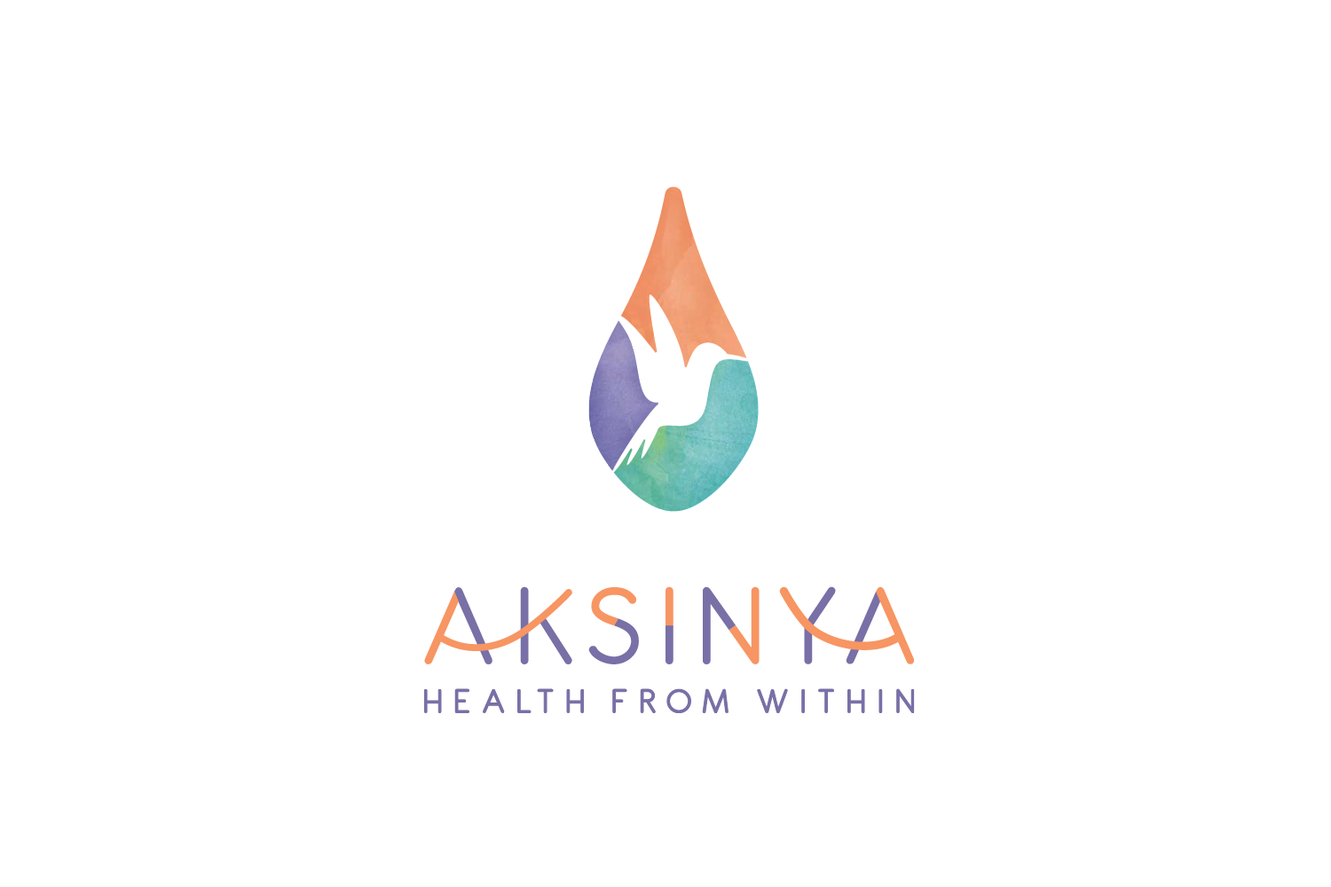
Nutritionist Aksinya Litovkin wanted to self-name her service-business because her name means “hospitable,” a sentiment at the foundation of her mission. She immediately embraced the concept of a stylized hummingbird in the center of a multifaceted water droplet, representing the “nectar” and the source of true vitality that exists within us all. The colors we chose are intentional: lavender (abundant, spiritual, majestic), teal (emotional healing, self-awareness, devotion) and coral (life force, energizing). The logotype used for her name has a connective, graphical quality to emphasize transition and fluid change.


